Your small business website serves multiple purposes: from educating the public to your brand and products; to showcasing your expertise in the field; to capturing data from prospects and clients alike. And now more then ever, it’s important to meet those prospects and clients where they are at. If they’re not calling you directly or sending a tweet, people might just fill out your contact form. How can you make it easiest for them?
Don’t Use Placeholder Text
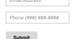
Multiple studies show that putting the form field’s label or instructional text into the field is harmful to users. When they click into the field to begin entering information, the placeholder text disappears, forcing them to remember what they were supposed to enter, and potentially in what format. Putting a strain on a user’s

In some cases, users may believe the fields are already filled in, or auto-complete functionality may input the incorrect data. And depending on how the form was designed and developed, there may be issues with accessibility for users with screen readers or visual impairments. Additional reading here.
Clearly Label Required vs Optional Fields
While completing your form, users should be able to easily distinguish which fields are required, and which are optional. Optimizing your form to include as few fields as possible will help with conversion.
Our take? Assume that ALL of your fields are required, only marking the optional ones as such. Instead of using the typical asterisk as a required field marker (*), which users may have a challenging time recognizing, it is better to denote the optional fields.
Include Helper/Informational Text
If your site or application requires a password to have at least 9 characters, and an uppercase letter, it’s better to tell users that up front. It is best to display that information outright instead of faulting the user after they have attempted to enter something.
Validate Data Before the Form is Submitted
Your form fields should use Javascript to validate the user’s data in real time so they know to update and correct fields with errors before they hit “Send.”

A Better User Experience
When it comes to creating great digital products, Opuscule’s history, research, study, and user testing are why clients choose us. In many
